

Logo Design
Nirvan — Incense Brand
Nirvan is a brand identity I designed for an incense stick (agarbatti) product, built around the ideas of ayurveda, serenity, and aroma. The process moved from open-ended brainstorming through symbolic exploration to a refined, symmetric wordmark that ties the brand's name, form, and color palette back to what the product represents.
ROLE
Logo & Brand Identity Designer
TOOL
Adobe Illustrator
.png)
01
Brainstorming

I started by mapping out everything the word "Agarbatti" could mean to a brand — ayurveda, aroma, serenity, happiness, sustainability — and let each branch suggest its own colors and associations. Ayurveda pointed toward natural, spice-inspired tones; aroma suggested floral shapes; serenity suggested cooler blues. This branching exploration became the foundation for the brand name, the logo form, and the color palette that followed.
02
Finding The Name
To name the brand, I looked for a word with strong global recognition that still captured the product's purpose. Nirvana kept surfacing — a word already associated with peace and transcendence — so I made a small tweak to it and arrived at Nirvan.
03
Designing The Mark
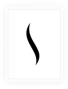
My starting point for the visual mark was a small ray of smoke — a simple, literal reference to an incense stick's fume. I deliberately kept this smoke element simple, so I'd have room to refine or evolve it later without redesigning the whole mark.
I then sketched a more detailed, unpolished version of the full logo — an incense stick with rising smoke sitting above the wordmark. It captured the idea but didn't yet feel resolved, so I refined it further: simplifying the elements and ultimately removing the literal agarbatti stick from the mark entirely, leaving just the wordmark with a stylized flourish of smoke rising from it. The result read as more refined and symmetric than the earlier version.
.png)
.png)
04
Color And Typhography
For the wordmark, I researched color meanings and landed on a shade I found described as "Nirvana" — it felt like a natural fit for the brand name. For the smoke element above the mark, I shaped it like a flower, since I felt the brand ultimately stood for aroma, and a flower was the clearest way to represent that visually.
.png)
05
Bringing It Together
Finally, I defined what Nirvan stands for as a brand and mapped each idea to a specific hue:
.png)
These three tones became the coloring for the smoke strands rising above the wordmark, tying the logo's visual identity directly back to the brand's core values.
.png)