

UI / UX Case Study · Virtual Workspace Platform
A product design story for Wurkr - the always-on virtual workspace that let distributed teams feel like they shared one floor. Rooms you could see into, mics that stayed on, doors you could knock on. This is how the experience was shaped, and the features that made it feel alive.
ROLE
Product & visual design
.png)
Subscribers & paid users at peak
4
Signature features shipped
3
Workspace views: floors, grid, isometric
Web + App
Responsive desktop & mobile design

The Wurkr floor view - every room visible at a glance, presence shown live, doors locked or open.
01
Overview
A virtual office you live in, not a call you join.
Most remote tools start a meeting and end it. Wurkr started the day. Your team's office sat on one screen as a cutaway building - rooms stacked on floors, people moving between them, ambient audio always on so a colleague was just a glance and a word away.
The design challenge wasn't building another video grid. It was translating the social texture of a real office - bumping into someone, knocking before you enter, locating a teammate, pinning a note to the board - into something legible on a flat canvas, for teams spread across countries and time zones.
My work spanned the end-to-end experience: the workspace views, the mobile app, a shared design system, and a set of new gamified features that made presence feel playful instead of surveilled.


Workspace design
Floor, grid & isometric views of the live office.
.png)
Notice board
A digital, gamified bulletin board per room.
.png)
Locate yourself
A glowing aura that shows where you are.
.png)
Fun Rooms
Sports & game rooms teams can actually play in.
02
Decision-Making
How we got from "remote is lonely" to a building you live in.
Every signature feature traces back to a fork in the road. Here is the path — the phases we moved through, then the key decisions that shaped the product, with the options we weighed and why we chose what we did.
Workspace design
Floor, grid & isometric views of the live office.
Notice board
A digital, gamified bulletin board per room.
Locate yourself
A glowing aura that shows where you are.
Fun Rooms
Sports & game rooms teams can actually play in.
01
Discover
Interviews with remote teams - what they missed about offices.
02
Define
Presence, serendipity & etiquette as the core problems.
03
Ideate
Sketches & wireframes for each metaphor and view.
04
Design
Hi-fi UI, the system, and gamified layers.
05
Validate
Ship, watch behavior, iterate on the fun.
Decision 01
How should the office itself be represented?
Literal 3D world
Immersive, but heavy & hard to scan.
Abstract status list
Efficient, but loses all sense of "place".
Cutaway building
Every room visible at once — place + scannability.
✓ CHOSEN
Why: Teams need to see the whole floor to feel co-located. The cutaway keeps spatial memory ("Anya is always top-left") without the cost of 3D navigation — and later opened the door to an optional isometric view.
Decision 02
How do you protect focus without locking people out?
Always Open
Total serendipity, zero privacy.
Calendar booking
Formal & slow — kills drop-ins.
Enter / Knock / Lock
Real-office etiquette: open doors, or knock to ask.
✓ CHOSEN
Why: The door is a social signal everyone already understands. An Enter door invites serendipity; a Knock door respects focus while still being reachable. No new mental model to learn.
Decision 03
In a busy building, how do you find yourself & others?
Search box
Works, but breaks the spatial feel.
Highlight border
Subtle — easy to miss on a full floor.
Glowing aura + tooltip
"You are here now!" — a friendly self-locator.
✓ CHOSEN
Why: Presence should feel warm, not like a security tracker. A soft animated aura draws the eye instantly and reads as belonging — "this is my spot" — which became the Locate Yourself feature.
Decision 04
How do shared announcements live in a spatial office?
Push notification
Interruptive & quickly buried.
Chat channel
Scrolls away; not tied to a place.
Sticky-note board
A digital pinboard, one per room.
✓ CHOSEN
Why: Presence should feel warm, not like a security tracker. A soft animated aura draws the eye instantly and reads as belonging — "this is my spot" — which became the Locate Yourself feature.
Decision 05
How do you make people want to come into the office?
More productivity tools
Useful, but doesn't build culture.
Scheduled socials
Feels like another meeting.
Gamified fun rooms
Football pitch, games & themed spaces.
✓ CHOSEN
Why: Belonging is built in unscheduled moments. Themed fun rooms you can actually play in turn the office into a place worth visiting — and gentle game mechanics reward showing up without ever feeling like surveillance.
02
Decision-Making
How we got from "remote is lonely" to a building you live in.
Every signature feature traces back to a fork in the road. Here is the path — the phases we moved through, then the key decisions that shaped the product, with the options we weighed and why we chose what we did.
Workspace design
Floor, grid & isometric views of the live office.
Notice board
A digital, gamified bulletin board per room.
Locate yourself
A glowing aura that shows where you are.
Fun Rooms
Sports & game rooms teams can actually play in.
.png)

03
Style Guide
One system holding a playful product together.
.png)
%20(1).png)
%20(2).png)
%20(3).png)
04
Workspace Design
The workspace, from grey boxes to a living floor.
I wireframed the office as a system of rooms, doors and presence before any colour went on. Below: the structural thinking, then the views it became.
WIREFRAMES
WF-01 · Application shell
desktop · 1440×900


WF-02 · Floor cutaway
room + door model

Each room is a self-contained card: label · door state · presence cluster. The aura marks "you". Doors carry all the etiquette.
WF-03 · Isometric concept
depth exploration
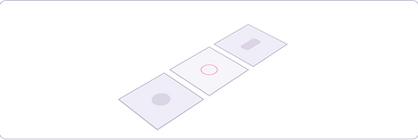
A top-down 3/4 isometric alternative — rooms become tiles you look into, useful for big offices and themed spaces like the game room.

.png)

UI SCREEN
05
Mobile App
The whole office, folded into a single column.
On mobile the cutaway building can't fit side-by-side, so rooms stack vertically — "Your Room" pinned on top, then "All Rooms". The door, presence and lock language stays identical to desktop so the model never has to be relearned.
WIREFRAMES

WF · Rooms
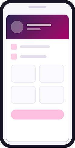
WF · Menu

WF · Settings
.png)

UI SCREEN


06
Gamified Web App
Make showing up feel like playing, not clocking in.
A layer of light game mechanics on top of the real workspace — levels, streaks, quests and team energy. The rule I designed around: reward presence and kindness, never punish absence. Nothing here surveils; everything here invites.


07
Signature Features
Four ideas that made the office feel alive.
Each started as a real-office moment and was redrawn — and gamified — for the screen.
Feature 01 - Notice Board
Every room remembers, even on the busiest days.
Every room gets a shared board where anyone can pin a message for the whole team to see and react to. Sticky cards in alternating Iris and Fuschia hold rich text, images and emoji — birthdays, standup times, festival wishes, shout-outs. It opens as a side panel right on the floor, so a room can show a Board badge instead of a door.
Feature 02 - Locate Yourself
Never lose yourself in a busy building.
In an office of a dozen rooms, "where am I again?" is a real moment. A soft, pulsing aura wraps your avatar wherever you are, with a friendly "You are here now!" tag. It's warm and playful — a sense of belonging, not a tracking dot — and it doubles as a way to spot teammates at a glance.
Feature 03 - Isometric View
A new way to see the whole office.
Beyond the flat cutaway, I introduced a 3/4 isometric world — rooms become tiles you look down into, each with its own walls, floor colour and furniture. It scales gracefully for big offices, makes themed rooms feel distinct, and supports right-click actions like Chat or Send to Reception directly on a person.

Feature 04 - Fun & Sports Rooms
An office worth visiting.
Belonging is built in the unscheduled moments. So the workspace got themed fun rooms — a football pitch with real goals, game rooms, lounges and kitchens — places teams could actually play together, not just meet. It's the part of the office people walk toward, and the strongest reason to log in when nothing's on the calendar.
.png)